Norfolk Commercial
Repositioning a Boutique Commercial Property Agency.
Brand + Design + Digital

Brand + Design + Digital
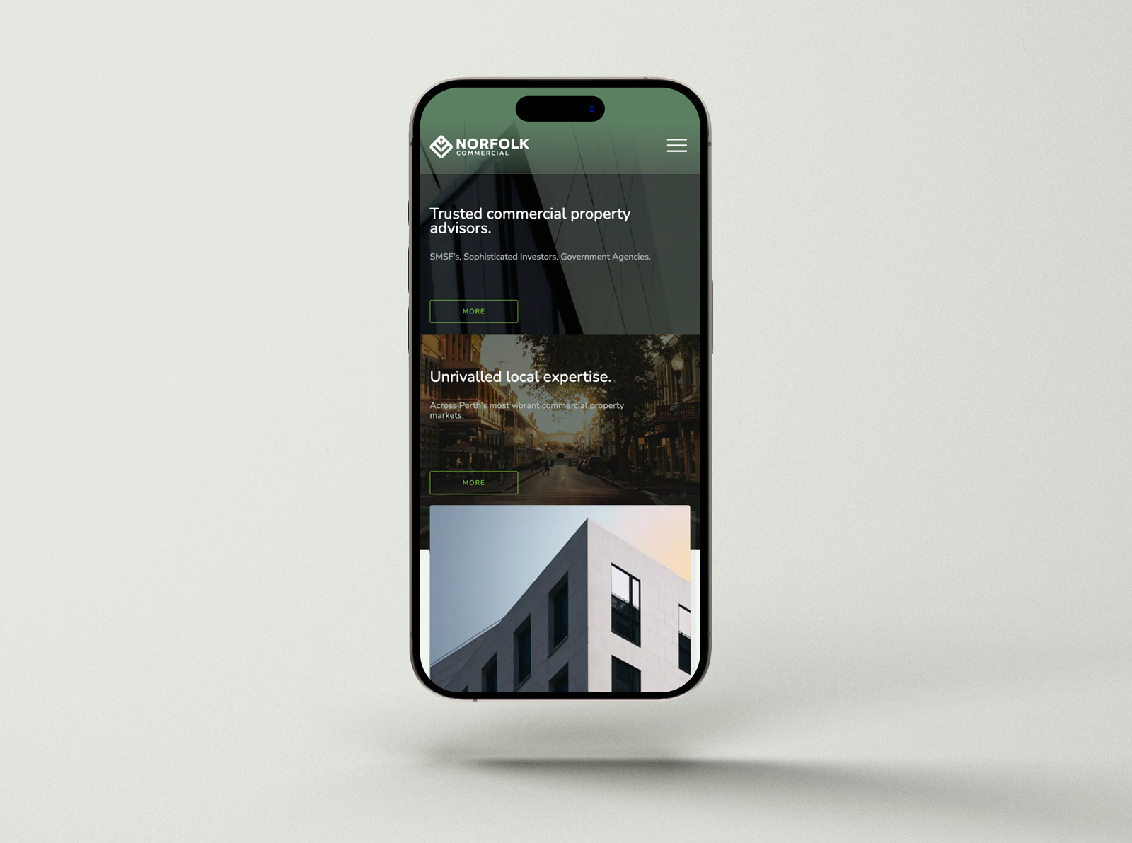
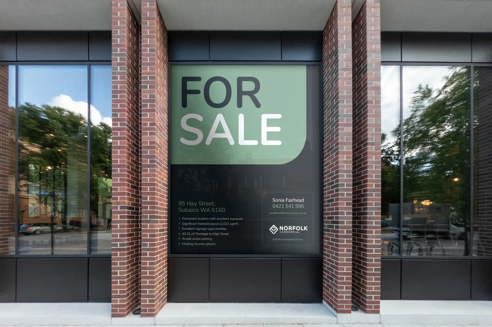
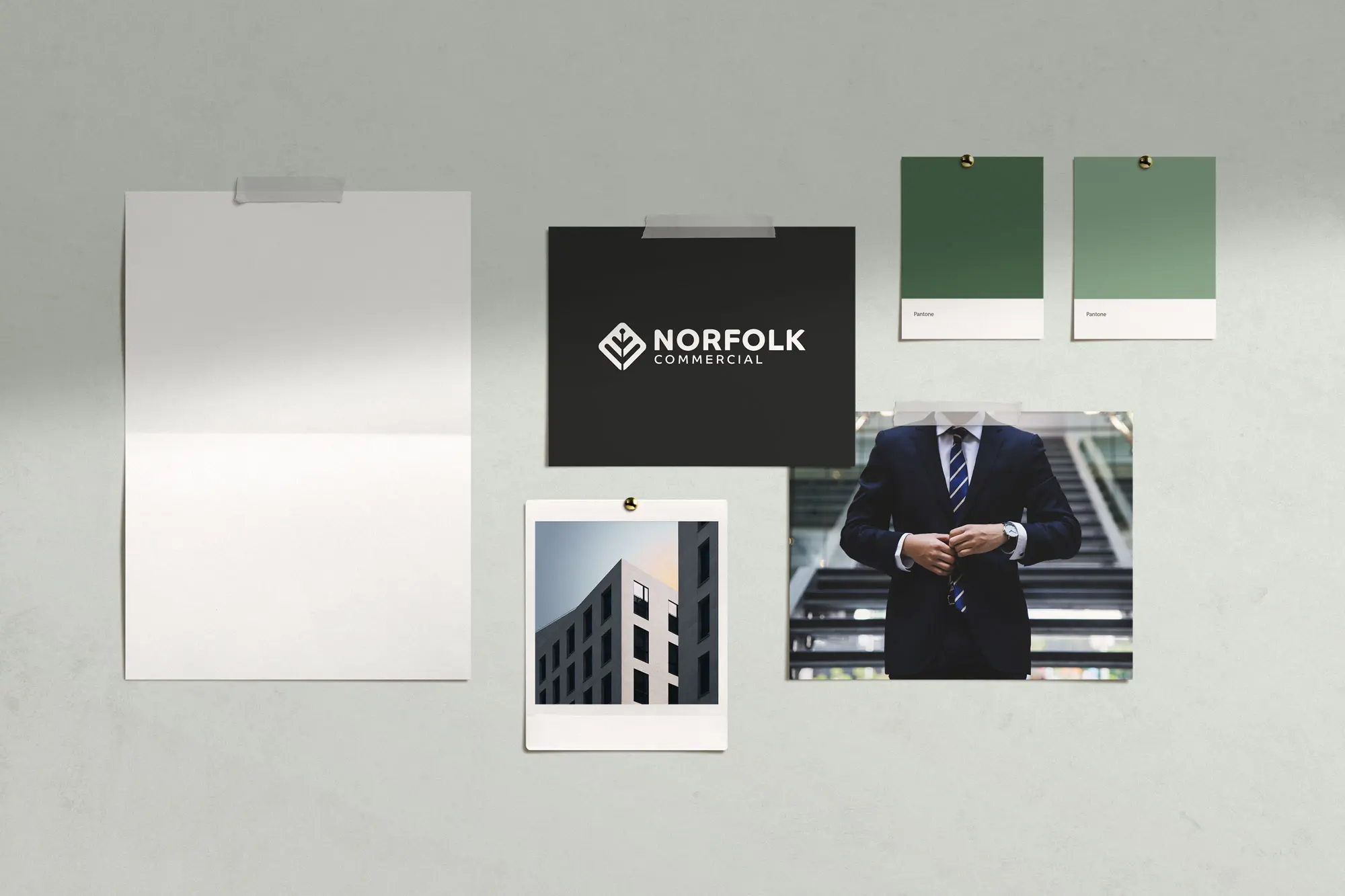
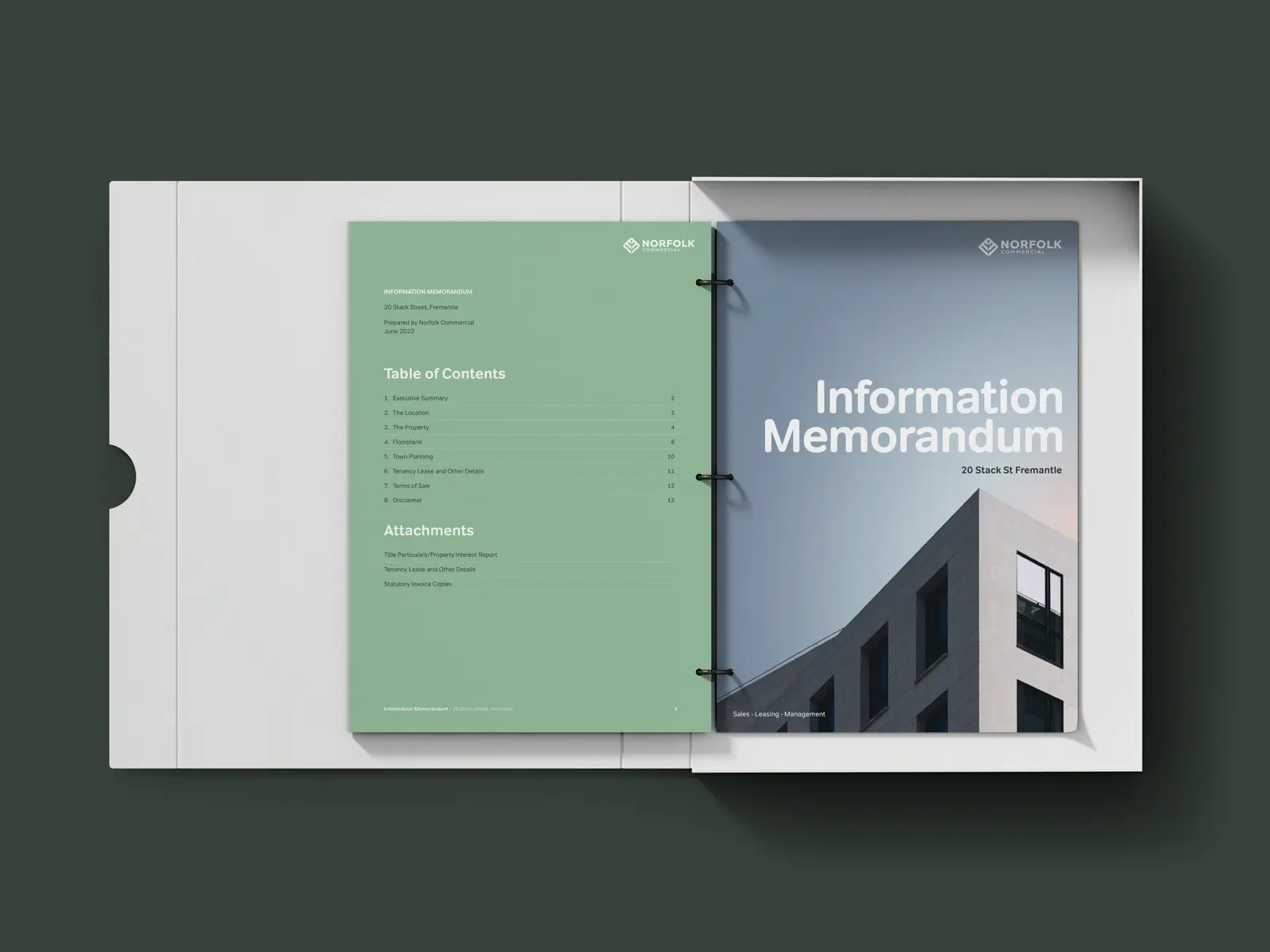
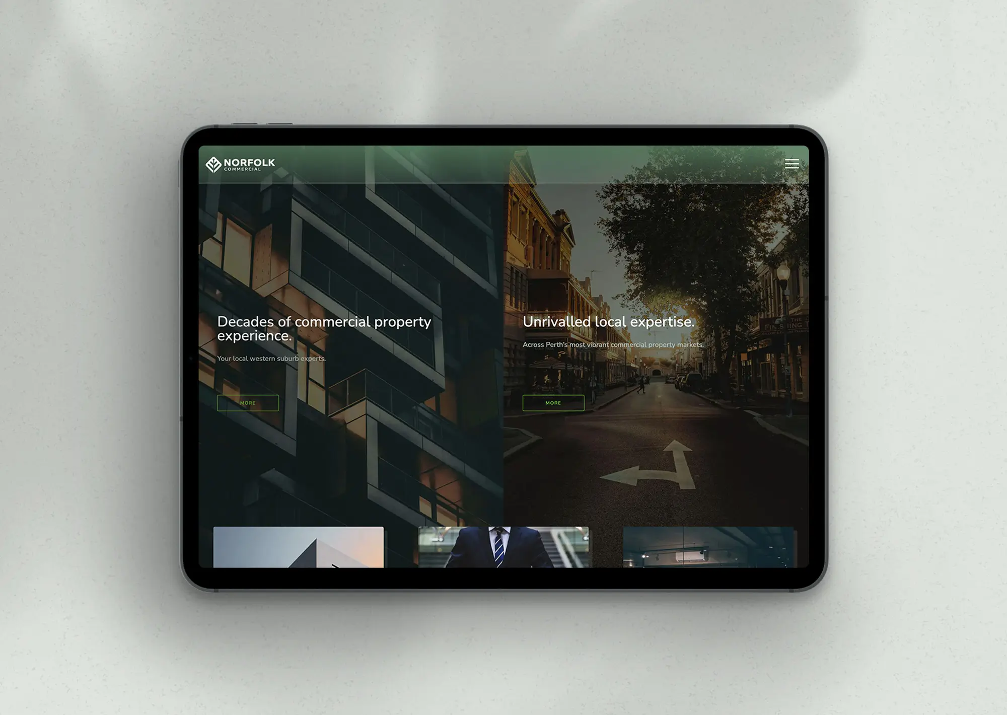
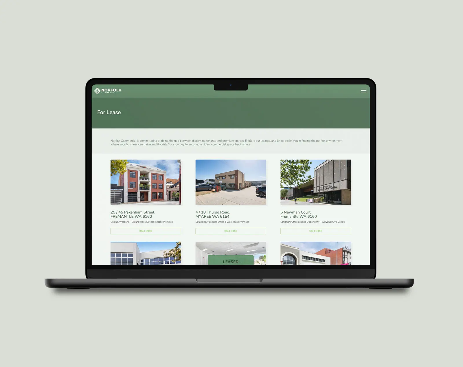
The challenge was to reinvigorate Norfolk Commercial’s brand without altering its logo, thus retaining a connection to its heritage while transitioning towards a more premium and professional aesthetic. The aim was to attract and resonate with the agency’s sophisticated clientele through a refined brand presentation. This involved adopting a new colour scheme, developing a distinctive brand style, and overhauling marketing materials, including proposal and tender documents, signage, and digital presence. A crucial aspect of the project was enhancing the website’s functionality to streamline property listings through integration with the REX CRM system, thereby improving operational efficiency.
A decade after Duncan first shaped our brand identity, we sought his expertise for a refresh to align with our evolved, sophisticated clientele. Duncan’s deep understanding of our vision led to a strategic and creative overhaul, including a new website, colour pallette, and literature, repositioning Norfolk Commercial effectively in our market. We extend our sincerest thanks to Hello Brands for their exceptional work and pivotal role in our brand’s evolution.
Tim Fairhead - Director

The brand’s appearance was elevated to a premium appearance by simplifying the logo to sleek black and introducing a softer green palette for a refined aesthetic. A comprehensive brand style guide ensured uniformity across all platforms. Enhancements included redesigned proposals, documents, and signage to bolster market presence. The website’s redesign and advanced functionalities, including integration with the REX CRM for seamless For Sale and Lease updates, streamlined operations and reinforced Norfolk Commercial’s professional image, setting the stage for continued success.