How to Select the Right WordPress Developer for Your Brand: A Comprehensive Guide.
DigitalIn today’s digital age, a website is the cornerstone of your brand. A website serves as the virtual storefront for your business, offering potential clients and customers their first impression of who you are and what you do. For companies based in Perth, Western Australia, and beyond, selecting the right website developer is crucial. If WordPress is your platform of choice, this decision becomes even more paramount.
But how do you ensure you’re choosing the right WordPress website developer who aligns with your brand’s values, understands the nuances of your industry, and has the technological prowess to deliver an exceptional website? At Hello Brands, we’ve devised a step-by-step guide to help you navigate this important decision.
10 steps to choosing the right WordPress Developer.
1. Industry Experience.
Your developer must understand the unique challenges and opportunities within your industry. This is not just about having experience but having the right experience.
- Ask for Previous Work: WordPress Developers should provide a portfolio of websites they’ve created for businesses in your sector.
- Brand Alignment: Consider how well these websites align with the respective brands’ messages, values, and goals. The developer should be able to translate brand ethos into a functional, digital format.
2. Scale & Complexity.
Every brand has different needs. A local cafe might require a more straightforward website compared to a large e-commerce platform or a sophisticated online magazine.
- Discuss Your Vision: Ensure the developer can handle websites of your intended scale and complexity.
- Explore Their Portfolio: Look for evidence of diverse functionalities, such as e-commerce integrations, membership areas, or interactive features.
3. Technological Proficiency.
The world of website development is vast, and the tools and technologies evolve rapidly.
- Up-to-date Tech Stack: Your developer should be familiar with the latest tools, plugins, and best practices within the WordPress ecosystem.
- Mobile Responsiveness: With an ever-growing number of users accessing sites via mobile, ensure the developer can craft mobile-optimised experiences.
4. Performance Metrics.
A beautiful website is meaningless if it doesn’t perform well.
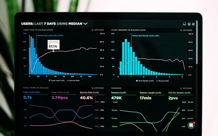
- Ask for Speed Tests: A developer should provide speed test results for current sites they’ve built. Sites should load swiftly, offering users a seamless experience.
- Security Measures: With cyber threats on the rise, it’s essential to understand the security measures your developer implements.
5. Testimonials & Feedback.
While a portfolio showcases a developer’s skills, testimonials give you insight into the working relationship you might expect.
- Ask for Client References: Speaking directly with past clients can provide candid feedback about their experiences.
- Online Reviews: Platforms like Google Reviews or industry-specific sites can offer additional insight.
6. Branding Experience.
Lastly, and perhaps most crucially for us at Hello Brands, is the developer’s experience with branding.
- More Than Just Design: Your website should be an extension of your brand’s story, voice, and aesthetic. The developer should not just be a technician but also a storyteller.
- Integrated Approach: Check if the developer collaborates with branding teams or has experience integrating branding guidelines into their web designs.