In the vast and intricate realm of marketing, the careful selection and application of colour in branding go far beyond aesthetics. This decision influences consumer behaviour, drives conversions, and establishes brand recognition. Let’s delve into the strategic depth that colour offers to marketers.
Strategic Colour Selection: Beyond the Basics.
While understanding the colour wheel is essential, the real game begins when colour in branding is used strategically. Selecting a brand colour isn’t just about the visual appeal; it’s about aligning it with the brand’s ethos, objectives, and target audience.
Colour Systems and Marketing Strategy.
- Analogous: This system is about harmony and unity. Brands aiming for a cohesive and consistent image often opt for analogous colours. It’s excellent for creating a seamless brand experience across different platforms.
- Complementary: Ideal for brands that want to create a striking contrast or highlight a specific product feature. The juxtaposition of opposing colours draws attention and makes content pop, especially in campaigns and advertisements.
- Triadic: For brands that want balance yet diversity in their palette, the triadic system provides variety without overwhelming the viewer. It’s an excellent choice for brands targeting a diverse audience.
- Tetradic: A bold choice, the tetradic system is for brands that want to make a statement. This palette, when used right, can cater to various audience segments within a single campaign.
Strategic Colour Categorisation.
- Natural Association: Brands that emphasise eco-friendliness, organic ingredients, or natural processes often opt for earthy, calm hues. It’s a strategy employed by brands to connect with environmentally-conscious consumers.
- Cultural and Psychological: Luxury brands, or those that want to emphasise exclusivity, often lean towards deep purples, golds, and dark blues. These colours resonate with notions of royalty, richness, and premium quality.
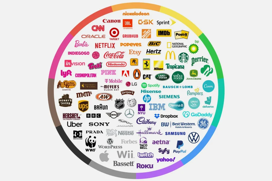
- Evolutionary: This category is about tapping into primal instincts. Fast-food chains use reds and yellows to evoke hunger, excitement, and impulsive buying. On the other hand, spas and wellness brands might use blues and greens to establish tranquillity.
